
In this post we will explore Cost function and Error Metrics of Logistic Regression.
Logistic regression is a Classification Algorithm used to predict discrete values.
Logistic Regression works similar to Linear Regression first to find the X coefficients and slope, in addition to that it applies the Y predicted value into the sigmoid function to map the received real value (ranges from -infinity to +infinity) into a binary value (ranges from 0 to 1).
To read more about this mapping, please check Logistic Regression Part I — Transformation of Linear to Logistic
Logistic Regression turns the Y-predicted value to binary value by placing the Y-predicted value in the Sigmoid function.
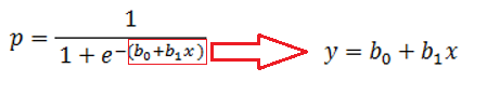
Thus, the Y-predicted value becomes the probability value ranges between 0 & 1.
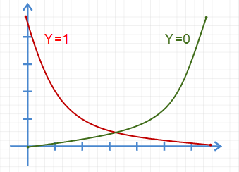
Now our new Y value falls in the Sigmoid curve.
If the p >= 0.5 then we make it as 1, and if p < 0.5 then we make it as 0.
The point 0.5 is called decision boundary.
In Linear Regression, the cost function is defined as,
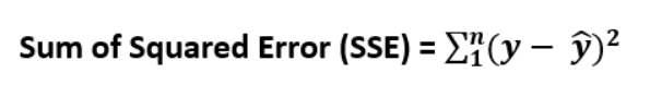
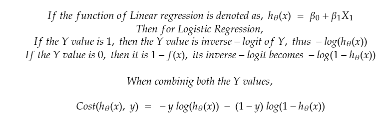
But for Logistic Reg. this will not be suitable as we already took logistic (Sigmoid) of the Y value received.
Thus, the Cost Function becomes,
Error Metrics:
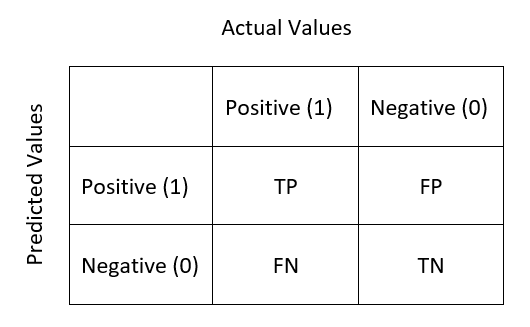
Confusion Matrix:
The predictions of our classification model will fall under any of this below categories:
· True Positive TP: Actual Value is Positive; Predicted values is Positive
· True Negative TN: Actual value is Negative; Predicted value is Negative
· False Positive FP: Actual value is Negative; But the model gives Positive which is a wrong prediction.
· False Negative FN: Actual value is Positive; But the model gives Negative which is a wrong prediction.
Confusing right? If we summarize this into a table, then it is called Confusion Matrix.
Lol. Its name is confusion matrix, but definitely not because its little confusing to understand at first.
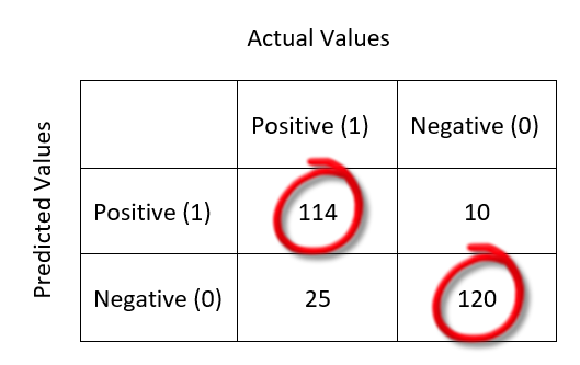
This is a clear representation of Correct Predictions. All the Correct Predictions fall in the diagonal order (marked with red circle). For example,
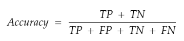
Classification Accuracy:
In Classification algorithm also, accuracy measure exists. But it measures by counting the total number of TP, FP, TN & FN. This metric measures the ratio of correct predictions over the total number of predictions. For Higher accuracy, the model gives best.
Recall / Sensitivity / True Positive Rate:
Out of all the positive classes, how many instances were identified correctly. i.e. Sensitivity describes how good a model at predicting positive classes.
TPR = TP/P = TP / (TP + FN)
The higher the sensitivity value means your model is good in predicting positive classes and only a few positives were predicted wrong.
For example, If the test data has 10 positive classes and 8 out of 10 were predicted correctly (True Positives), then that means, 2 positives were predicted as negatives (False Negatives).
TPR = 8/8+2 = 0.8
As when the denominator FN (wrong predictions) increases more than numerator TP, the value of TPR decreases. Thus, higher the TPR, higher the correct positive predictions.
In some models, we can accept some rate of false positives, but false negatives will not be encouraged. For example, in the Malignancy test, if the malignant positive patients predicted as negative is more dangerous than negative patients predicted as positive.
At this time, we need to focus on getting a good sensitivity rate.
False negative rate is the inverse of TPR.
FNR = 1 — TPR = FN/ (FN + TP)
Specificity / Selectivity / True Negative Rate:
Number of false positives divided by the sum of the number of false positives and the number of true negatives. Specificity describes how good a model at predicting positive classes.
TNR = TN/N = TN / (TN+ FP)
Example: If the test data has 10 negative classes and 8 out of 10 were predicted correctly (True Negatives), then that means, 2 negatives were predicted as positives (False Positives).
TNR = 8/8+2 = 0.8
As when the denominator FP (wrong predictions) increases more than numerator TN, the value of TNR decreases. Thus, higher the TNR, higher the correct negative predictions.
In some scenario, where false positives are not acceptable, but some rate of false negatives can be negotiated, we need to focus on Specificity more than Sensitivity. For example, if the POSITIVE results of a drug consumption test of players are punished severely by law then it is dangerous when a person who did not consume drug is accused wrongly.
In this case we need to focus on Specificity.
False Positive Rate is the inverse of TNR.
FPR = 1 — TNR = FP/ (FP + TN)
Precision / Positive Predictive Value:
Out of all the predicted positive instances, how many were correct.
Precision = TP / (TP + FP)
F-Score:
From Precision and Recall, F-Measure is computed and used as metrics sometimes. F — Measure is nothing but the harmonic mean of Precision and Recall.
F-Score = (2 * Recall * Precision) / (Recall + Precision)
ROC Curve:
Even though the Classification accuracy is a single value from which we can know the accuracy of the model, this information is not enough for a classification algorithm.
For a binary response variable, for some reasons we may need to know how good a model can predict each of the classes.
ROC (Receiver Operating Characteristic) curve is a visualization of false positive rate (x-axis) and the true positive rate (y-axis).
Even though we have the Sensitivity rate to find the goodness in predicting positive results, ROC curve gives a visualization to understand better.
Each point on the ROC curve represents a sensitivity/specificity pair.
The Blue dashed line is the random classifier i.e. 50% of chance for each class which is worthless.
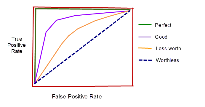
From the above picture, you can identify the what is good in ROC Curve and what is bad. This picture is hand drawn just to compare what is good and what is bad.
The original ROC Curve got for a diabetes training dataset is mentioned in the top of this article “ROC Curve — AUC Score” which we will be looking in the next part of this series.
An example ROC curve of Titanic Disaster Survival Prediction.

Observations from ROC Curve:
👉 Drastic increase in Y axis means High number of True positives i.e. High number of Correct predictions.
👉 The closer the curve follows the left side border and the top border, the more accurate the test.
👉 The closer the curve is to the 45-degree diagonal, the less accurate the test.
👉 If the curve, goes high to reach the top left corner then the curve will cover more area under it. This area is calculated and denoted as AUC (Area Under ROC Curve) score or AUROC score.
👉 If the AUC score is 0.5 then the curve is nothing but the random selection.
👉 If the AUC score is 1 then all the area is correct predictions. i.e. Perfect model.
👉 Higher the AUC score, better the model.
Conclusion:
In this article we have seen cost function and error metrics.
In the next article of this series we will be looking into the programming section of Logistic Regression using Python.
Previous part — Logistic Regression Part I — Transformation of Linear to Logistic
If you find any corrections, I am really grateful to know that, please add it in comments.
Thank you! 👍
Like to support? Please just click the heart icon ❤️.
Happy Programming!🎈